Neco Rebranding
Branding
Overiew
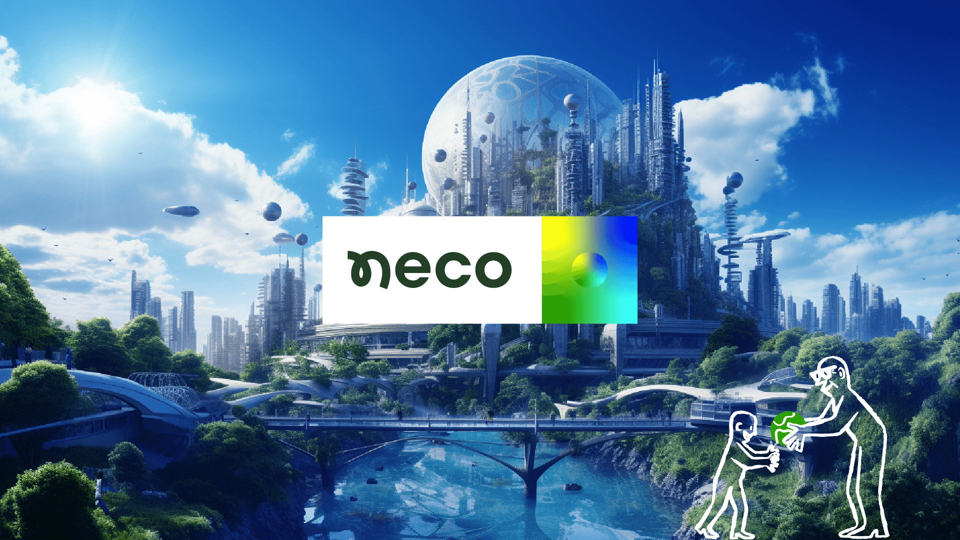
So the challenge is to create a new visual identity for Neco that enhances its credibility and its values of equality, sustainability, diversity, sufficiency, transparency, and stability.
Results
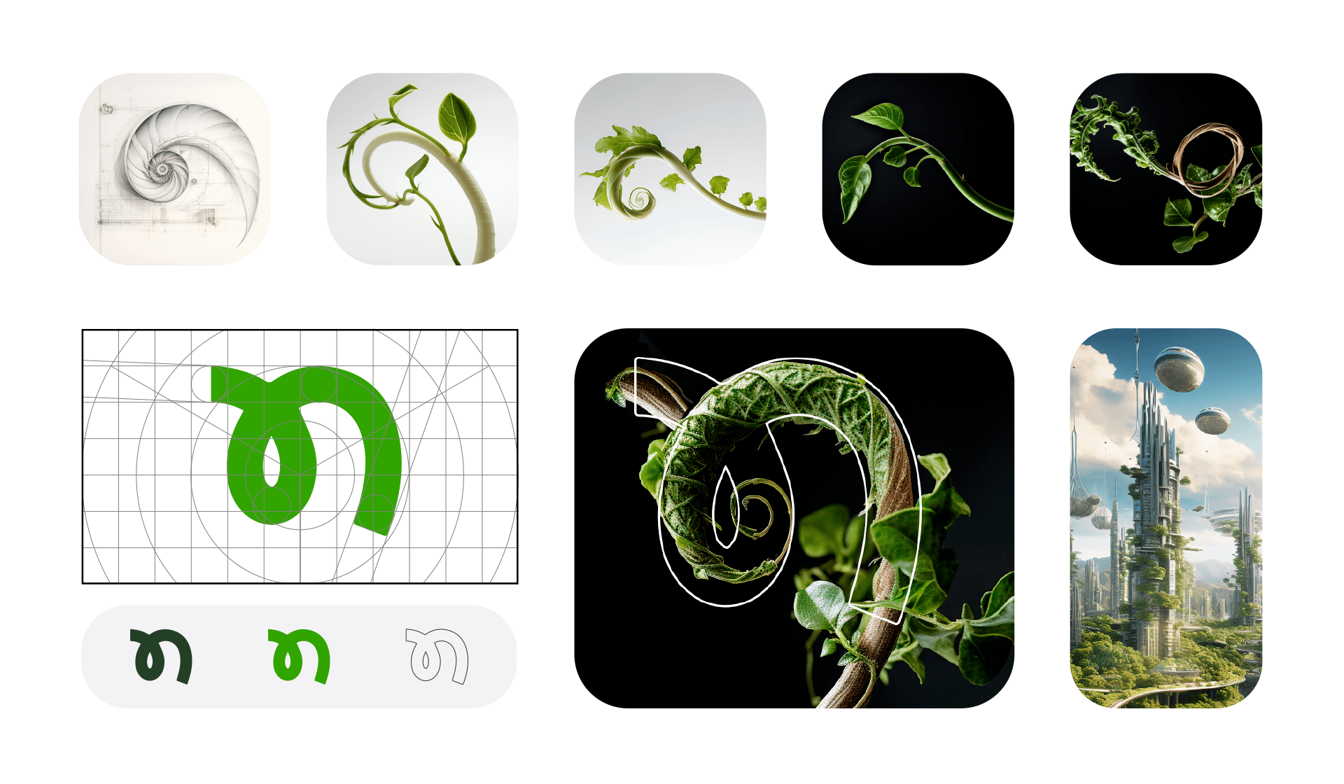
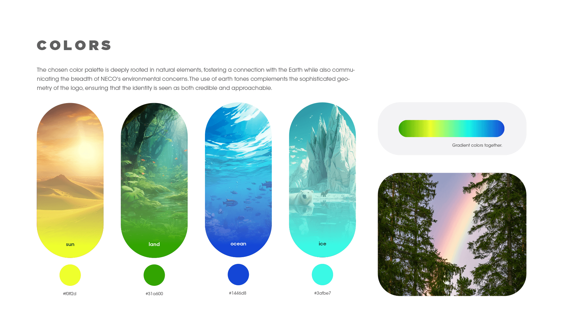
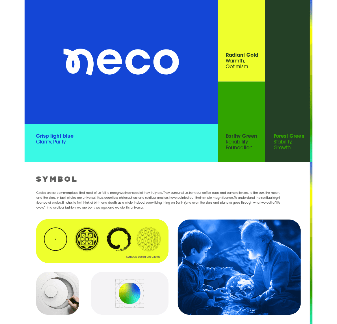
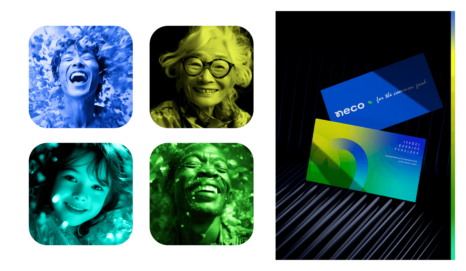
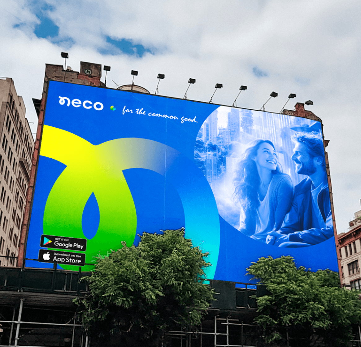
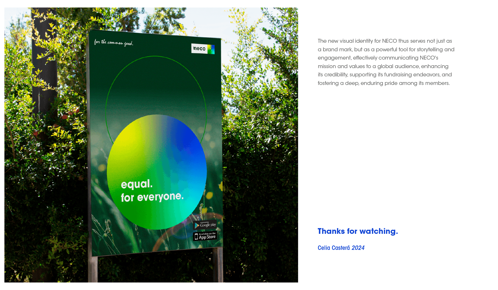
I was inspired by the golden ratio and the natural geometry of all plants and shapes found in nature. Therefore, a simple, organic, and sophisticated symbol is born: the "N" of Neco. The chosen color palette is deeply rooted in natural elements. I use the concept of the rainbow to create a gradient of all the colours. We use the circle to think of birth and death.
Industry
Year
Client